Monday, October 31, 2005

Comics Done Right - New Thunderbolts #14

For me, New Thunderbolts #14 is a prime example of what I want in modern-day superhero comics: brightly colored costumes, a fast-clipped pace, a mix of characterization and subplots while there’s a big brawl going on, snappy one-liners and ominous foreboding—this one has it all! By no means is any of it deep, as such, but that’s just the thing: it’s fun to sit down and read about these very flawed characters interacting and growing without stretching the point. Seeing Songbird turn into an ever better leader, for example, is good stuff; her being coerced to put the smackdown on the New (and stupid) Avengers only makes things more compelling because the positive growth is marred by negative actions.


In regards to the New Avengers guest-starring, it was odd that Wolverine wasn’t around. Nicieza probably covered it in the previous issue, but considering that the inclusion of both Spider-Man and Wolverine in this band of heroes is a big part of their appeal, it’s baffling that Wolverine is nowhere to be found in this issue or in any of the other stories featuring the New Avengers in a guest slot this month (She-Hulk, Runaways, Young Avengers...). No skin off my nose, since I dislike seeing Wolverine all over the place to begin with, but it seems at odds with the sentiment of turning the Avengers into a group showcasing their high-profile marketing/merchandise characters (plus Bendis’s favorites, of course).


But since this is not about Bendis’s Avengers, let’s concentrate on the issue at hand, and why it was good. We start off on a good note already with the recap/credits page, which is written in the form of an internal memo from Carol Danvers (the once and former Ms Marvel, presently Warbird) about the so-called “Operation: Hubris”, i.e. the Thunderbolts being engaged to humiliate the New Avengers for intriguing reasons. It’s a great way to bring people up to speed about the plot while also giving us insight in Carol’s own character.


The opening double-page spread of the confrontation between both teams is also a great deal of fun. I’m a big fan of Tom Grummett’s art, as it is a nice example of concentrating on the essentials rather than an overwhelming amount of lines that cover up meaning rather than enhancing it. As stiff and unattractive as Erskine’s pencils are over in the pages of Jack Cross, I think his embellishments here complement well with Grummett’s pencils. Add to that colors that pop off the page and crisp lettering, and you’ve got yourself a nice-looking comic.


It doesn’t hurt at all that the story-page/ad ratio is more than decent. An opening chunk of 6 pages of story, then the usual story/ad/story/ad routine for a few pages, then 3 pages of story, 1 ad, 3 more pages of story, back to story/ad/story/ad and finally another 4 pages of story only broken up by the letters page—speaking of said page, I can’t for the life of me figure out why both Marvel’s letter columns and the DC In Demand pages are so often two pages before the end rather than at the final page. Wouldn’t that make more sense? I assume it’s a printing thing, but since the letter column here corresponds with a page of art in the beginning of the book, same as it would’ve if it were the very last page, I’m left scratching my head here. In any case, unlike some other books Marvel produces, this one has a reasonable flow to it. Things actually happening also helps, naturally :p


Another reason why this was good: I got through the entire issue without having to grimace in annoyance. Quite the opposite, I was often amused by the dialogue or the situations, not to mention intrigued by the subplot about Techno and Abe needing the thrown-out Blizzard to save the world. Now, Zemo and Techno have a history of working together, so I’m assuming they’re in league once more, unless it’ll turn out that they’re actually at odds, because Nicieza does like his twisty-twists, after all. Whatever the case may be, it’s great that the coming months will focus on Zemo and his mad schemes and the way the team will get embroiled in them.


Ever since the start of the first Thunderbolts series, nearly 9 years ago, Baron Helmut Zemo has been a joy to behold as a cunning, ruthless, multi-faceted character who is obviously a villain yet has bizarre heroic tendencies. Kurt Busiek carved out that path for him, to be sure, but Nicieza surely expanded on it. After a year without Zemo, it’s good to have him back—having him revealed as the mastermind behind most of the team’s troubles and misadventures since the relaunch is only icing on the cake.


Highlights of the issue for me were:
  • The cover spotlighting a cool-looking Radioactive Man and the beaten Avengers (shown symbolically by a damaged shield, a torn off mask, a battered helmet) with a worn-out Songbird in the back
  • Spidey using Atlas as a “building” to attach his webs to (and Atlas subsequently shrinking down)
  • Atlas literally stomping on Iron Man
  • Spider-Woman and Joystick going through a vicious catfight (over 2 hours!)
  • The Avengers realizing that the government is not best pleased with them
  • Melissa just leaving Luke Cage hanging for a fight
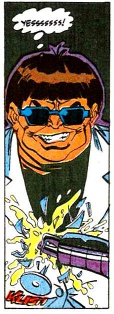
  • Zemo showing up, bringing portents of doom and destruction, always my favorite bit of course :)


To finish up, I want to extoll Grummett’s artistic virtues once more. The man has an excellent eye for laying out a page, always keeping things dynamic without them being confusing. Just look at this page of Joystick and Jessica Drew duking it out, or this one (bonus points for making Spider-Woman look hot but not gross :p). I’m very fond of the way Grummett will tend to shift the panels around, never really making two pages look alike without overdoing it and turning things into a confusing jumble of images. I also get a real sense of things quietening down just from looking at the more organized panels once the fight is over. Writer and artists have a great synergy going on throughout the entire issue, with caption boxes and dialogue adding to the flow of the story rather than clashing with it. Everything just keeps on moving. The final panel zooming in on Zemo makes for a great image to end the issue on (although Spider-Woman’s butt shot only a few pages before that isn’t half bad either :D)


I hope that this Thunderbolts series will be around for a good long time to come because it’s one of my favorite titles on the stands, and it has been since that day in February 1997 when I was stunned—stunned I tell you!—by the out-of-the-blue revelation at the end of the first issue. This book may not be for anyone, as it is not “sophisticated” or anything like that, and admittedly Nicieza has a tendency to get bogged down in McGuffins and plot mechanics rather than telling a straightforward story, but there’s no denying the density of this book; decompression is totally lacking here and that’s just how I like it.


Top things off with a nice letter column and we can come full circle: this one did have it all. I just wish it were biweekly all the time!

Saturday, October 29, 2005

Saturday Morning Loot

Every Saturday morning I drive into town to get the latest batch of comics on my pull list. While I’m there anyway, I tend to go through several other stores and buy various stuff that catches my interest. This week my bag of loot included the following:
  • The second halves of the CSI season 3 and 4 dvd sets (13 episodes each)
  • Two classic Lucasarts games: The Dig and Full Throttle
  • Another game called Heaven & Hell
  • As for comics: Wonder Woman v2 #222, Jack Cross #3, Adventures of Superman #645, JSA Classified #4, Defenders #4, Hulk: Destruction #4, New Thunderbolts #14, Young Avengers #8, She-Hulk #1 and to round off, Bart Simpson’s Treehouse Of Horror #11.

If it hadn’t been for the twenty dollar discount at the comics store, this would’ve cost me 105 euros in total (54 for the dvd’s, 21 for the games and another 30 for the comics). Still, this should keep me entertained for a good long while. Some thoughts:

Why oh why does it always have to be Cat and Grissom on the CSI covers? I’d love a Sara/Greg one, or a Sara/Brass one—how hard can it be? (Note that I really want Jorja Fox on the cover, heh.) For some reason they release them as half-season sets here. Heck, the first season even had a different opening theme, something instrumental and ooh-ah'y rather than The Who's "Who Are You". Go figure out us weird Europeans, eh? ;)

The Dig and Full Throttle are two Lucasarts adventure games that I had to pass on back when they came out because I was a mere high school student and couldn’t afford them. I’m glad I didn’t fork down the high price for them back then too, because so far they don’t look like they’d offer the same kind of entertainment as, say, Day of the Tentacle did. I went through the introduction scenes of both and played them a little bit and thus far they’re not that exciting. The Dig is sci-fi oriented and supposedly has lots of puzzles; I’ll believe it when I see it.

Full Throttle is a biker’s quest to stop his gang from being ambushed, which is rather insipid as adventure-quests go (not quite up to the level of King Graham trying to save his family from an evil sorcerer and encountering a bevy of magical creatures along the way, back in the glory days of King’s Quest). Lucasarts games were great because of their awesome use of humour and quirky storylines and puzzles (I’m thinking of Sam & Max Hit The Road in particular here). From what I’ve heard, these two were duds in comparison, but for 6 bucks each, I won’t complain if the rumors turn out to be true!

Heaven & Hell caught my eye because it reminded me of the supremely fun Majesty. You can choose between being a benevolent god or an evil demon and your purpose is to try and convert as many people as possible and then bring about the End of the World. The screenshots seemed fun and I always like when they combine strategy games with out-there concepts, so who knows, maybe this’ll be just as fun as Majesty, which was highly addictive back when I was first exposed to it. I played the tutorial level so far and it had nice visuals and sounds, so I’m not disappointed yet.

On the comic book front I’ve read 4 of the 10 comics I bought so far. Adventures of Superman #645 promises to be written by Rucka and drawn by Kerschl on the cover, but in reality Rucka only plotted with DeFilippis/Weir from New X-Men fame (meh) scripting the issue, while Kerschl only pencilled two thirds of the story and Renato Guedes did the final third. I call that either false advertising or simply not giving credit where it is due. Even though the issue is juggling several balls at once (Ruin’s identity and benefactor, Luthor’s schemes, the half-assed OMAC assault, Lois’s investigation into who shot her) it still manages to end up feeling rather flimsy in the end.

It’s clear Rucka had a plan when he started his run, but it feels like they’re doing a lot of stretching and padding here just to keep things unresolved. Frankly, it’s annoying/boring more than it is exciting. Kerschl’s pages look sweet as usual, delicate yet bold, and Guedes’s fill-in pages aren’t horrible either, but the styles don’t seem to mesh altogether well. I’m also not fond of Kerschl needing help all the time, he’s barely done a full issue of his own since he started a few months ago (same deal with Rags Morales on Wonder Woman). Sidebar: having Perry exclaim that the world may be ending, but they still have to report it, was far better executed and poignant back when they had him say it during The Final Night. Ah, Kesel and Immonen, good times, good times... I loved Luthor’s evil smirk on the cover, at that.

JSA Classified #4 concluded the Power Girl origin story. I’m not quite sure why we needed 4 issues to tell us this, because it seems pretty straightforward despite the parallel universe mumbo-jumbo. It feels like Johns is trying to complicate rather than trying to present a clear picture, and I don’t see why. Amanda Conner’s art is fun and whimsical though, and I’ve always liked the Psycho Pirate, so I was happy enough with this—besides, I have no quarrel with any Infinite Crisis-related stories.

DC does need to do something about the vaunted open-endedness of almost all their current storylines though; the to-be-continued-in-another-book endings are likely to be bothersome to a great deal of the readers. Not so much to me though, since I tend to buy them already anyway, but still :) Next issue features the Injustice Society, which includes the Gentleman Ghost. This makes me very, very happy indeed, because Gentleman Jim Craddock kicks butt! (almost as much as Jorja Fox does, mmm ;))

Wonder Woman was written by Rucka and featured guest-art by the unfortunately named Cliff Richards. I just always get flashes of “Living Doll” featuring the Young Ones when I hear that name. Ray Snyder provides the inks, giving the book a delicate, pseudo-shadowy yet fairly flat look. It’s not bad, but it’s not all that great either. I don’t know how Cheetah’s appearance here (not to mention Diana’s) works with the events as portrayed in Infinite Crisis #1, but that’s par for the course with DC lately, not yet having grasped the concept of a clear timeline. I liked her caption boxes, very nice effect there with the yellow/spotted look (ditto for the Psycho Pirate’s captions over in JSA Classified).

It was odd to see Wonder Woman taken to The Hague, but I guess that adds some seriousness to the situation? I’m sure they made several stupid mistakes though, but I’ll try not to care. Interesting how Barry Allen was involved in a murder trial as well before they killed him off during the Crisis. Hmm... More OMACs too in this one. They’re everywhere, aren’t they, and they’re about as effective as your average fruitfly, it seems. Nevertheless, Rucka and company continue to try to make it look impressive and foreboding whenever they show up, but it’s not quite working. I can’t say I was all that enthralled by this issue, but it didn’t make me gag either. Considering the pivotal role Wonder Woman is playing in this entire Crisis business, I was expecting something more though. Pity.

Finally, I also bought and already read last week’s She-Hulk #1 because of the good reviews. Even though I think Slott isn’t looking at the big picture when he complains about those waiting for the trades in-story, I’ll give him what he wants and I’ll buy both She-Hulk and the Thing in ongoing, monthly form rather than holding out for the superior product. Since Slott is good at making a single issue very enjoyable in its own right though (wonderfully assisted by Juan Bobillo on art chores), I don’t think I’ll regret my decision.


Slott’s way to potentially bring back Hawkeye is a classic one, I’m sure they’ve tried it in various sci-fi stories, but it should still be a lot of fun to see him playing with perceptions and expectations and then doing some nice, inspired twisting. Here’s hoping. In the meantime I’ll join the crowd in giving this two thumbs up, as it’s just pure fun, and that’s all I need in a comic, really.


Speaking of fun, the eleventh Treehouse Of Horror special looks like it will be too. I’m lucky my store still had a copy (they had 3, actually) because it features a Wolfman/Colan spoof on their acclaimed Tomb of Dracula and a Wein/Wrightson parody of their equally acclaimed Swamp Thing. It’s worth the price of admission for those two stories alone, I’m sure, but the 5-dollar price tag ends me up with 56 pages of story with additional art by John Severin and Mark Schultz, among others. Very nice deal, and I expect it to be enjoyable if not outright hilarious.


As for the rest, I’m really looking forward to reading New Thunderbolts #14 because Nicieza continues to write engaging yarns about these characters and of course Tom Grummett on art is always a good thing. Exciting-looking cover, too. Meanwhile, Defenders is still trying to recapture the old Giffen/DeMatteis/Maguire Justice League vibe, and while it’s not quite succeeding, it’s still a joy to read DeMatteis’s one-liners and let my eyes roam over Maguire’s scrumptious pencils.

I flipped through Hulk: Destruction (whose cover made me think of the Hulk/Wolverine one that Adam Kubert started his run on the Hulk with--I'll have to write about that sometime because it was a neat run) to count the story pages because the issue somehow felt thicker and I was hoping for an extra-sized final chapter, but it turns out it’s just your regular 23 pages with each page followed by an ad. Truly pathetic.

Looks like Young Avengers is just as bad in that respect. And Slott wonders why people prefer to buy trades instead? No freaking ads, baby! I hope that Jim Cheung is back next issue because just getting a cover from him isn’t all that satisfactory—DiVito’s not bad but by contrast he’s a bit boring. Jack Cross, meanwhile, features a pretty dull cover promising me a gunfight on Guantanamo Bay. If it wasn’t Warren Ellis writing this, I don’t think I’d be bothered. I still might drop it after next issue concludes the current arc because unlike his far superior Fell, this one is dragged down by all of Ellis’s usual flaws, not helped at all by Erskine’s oddly stale art.

And that, as they say, is that. Now, to decide what to watch, read or play next...


Tuesday, October 25, 2005

Judging A Book By Its Cover: Firestorm #18

The other week I was reminded that sometimes the cover of a superhero comic can seemingly kick all kinds of ass without actually representing the tone of the story to be found within. When I first chanced upon the cover to Firestorm #18 as drawn by Matt Haley--in Previews, a couple of months ago--I was very much looking forward to an issue that'd show Jason Rusch, the current-day Firestorm, being absorbed by the gone-crazy OMAC Project, potentially even becoming villainous for the length of the recently started Infinite Crisis. At least, that's the impression I got from the cover image, which did a good job on incorporating the Brother Eye image with Firestorm's outfit.

While the actual story told by Stuart Moore isn't a bad one, I found it disappointing simply because it has nothing whatsoever in common with the cover and doesn't live up to its seeming intensity. It's the 21st-century equivalent of the original Crisis's "red skies crossover", really: OMACs attack, OMACs get beaten and then "mysteriously" disappear. After seeing this in virtually every DC comic I buy (and there's a lot of them) in the past six months, I'm really, really, really getting tired of it. I wouldn't mind it as much if the cover wouldn't imply something far more menacing and troublesome than what we actually got.

There's a distinct upside though: the issue was penciled by Pat Olliffe, who in my mind is right up there with Sal Buscema ("our pal Pat?" :)) Neither one of these guys is flashy or anything, but they know how to lay out a page, how to tell a story visually, how to draw me into the story. The inks by Simon Coleby--a name I'm not familiar with--are somewhat rougher than what I'm used to in the pages of the very entertaining Spider-Girl, but both Al Williamson and Sal Buscema, Olliffe's usual inkers, do have a rather crisp style.

I wouldn't mind at all if Olliffe got to do some more work over at DC. I love him on Spider-Girl but enjoy Ron Frenz there as well, so I'm all for Pat taking on heroes like Superman and Batman. He knows how to economize his pages so he'd be fun for a team-up type book with a lot of characters rotating, I think--although that's probably what they've got lined up for either one of the Kuberts, and if so, I'll likely be buying it. But that's a whole other story...

In any case, I think it's a bit of a shame that a cover that implies some serious danger ends up being rather mellow. It's okay in its own right, but I would've preferred something more exciting. I dare hope that we're just slowly building up to a bigger, more epic type of story, since the character of Firestorm does tend to lend itself to large-scale mayhem.

All in all: a good cover, but it provided a bit of a let-down for me.


Sunday, October 23, 2005

Something I Miss In Current Comics...

I've really come to miss numbered pages in modern-day comics. It used to be that numbering was actually included by the artists themselves, an approach I always found very pleasant and handy in that you can actually refer to specific parts of a story without having to count pages yourself.

Of course, the companies managed to make it confusing in the 80s and early 90s by numbering the pages while counting the ads, but at least there were still numbers to refer to. In the later 90s, which is when I began reading American comics on a weekly basis, there were also some cool ways of numbering individual pages; in the various Spider-Man titles, for instance, they'd use a little web behind the number, or a Spidey-mask-eye, or a Spidey-mask-as-a-whole, all very cute, but I guess in the end it was too expensive or something to have these added by the letterers, I presume (or too difficult?) and both Marvel and DC have dropped numbering completely, as far as I can tell.

I don't understand why an artist can't include the page number in a corner though (the way Sal Velluto did during his great run on Black Panther). Belgian strips still do it all the time--heck, they use them for every actual band of art, so that's 4 times the numbers American comics need. Whenever I read an old back issue and I see those numbers, I yearn for them to make their big comeback one day. If letterpages can slowly creep back into Marvel comics, I can only hope the same will happen to numbering! (though preferably in DC books first, because I read more of them currently--how times have changed in those 8 or 9 years...)

Yes, I get caught up in the little things, sue me :)

Saturday, October 22, 2005

A Neat Idea Made Neater Still

In that selfsame issue of Captain America I mentioned in the previous post, there was also a Hostess Fruit Pie ad featuring the Thing versus an animated building:

I’ve always liked the idea of inanimate objects made sentient, and it becomes all the cooler with buildings, so I looked up a few images that sprang to mind when I saw that ad. John Byrne also used the concept in Superman v2 #11, when Mr. Mxyzptlk—which I pronounce “Muhxeezuhputluk” no matter what others think. I also say/think “Darkseed”, not “Darkside”, so there :p —brought the Daily Planet building to life as one of his first post-Crisis stunts:

Alan Moore ran with a similar idea in his second issue of Tom Strong, introducing the Modular Man to us, an inventor called Temple Baldry, who had created a special kind of immortality by putting his sentience into critter-like modules that replicated themselves like a virus and were able to take over scores of buildings and the like in no time. Chris Sprouse gave Moddy (I’m like Spider-Man in my desire to shorten villains’ names) a very eerie design, and I’m particularly fond of Todd Klein’s echoey font for Baldry:

Alex Ross and Jim Krueger took it one step further still in their Universe X series, very ably drawn by Dougie Braithwaite, who should really do more in comics because he’s great. He’s currently penciling the JUSTICE maxi-series, which Alex Ross then paints over—looks really sharp, even if the story is a bit slow, so far. But I don’t care with art that nice-looking. In any case, back during Universe X, they had the Absorbing Man absorbing the whole of New York City (!) turning him into this:

Best of all: the Big Apple sticks around like this, shaped like a giant Crusher Creel, with all the buildings at bizarre angles and such, making the city look incredibly surreal. I think it’s a quite original idea; it was one of my personal highlights of the entire X-trilogy and wish they had shown more of how the people adapted to living in a New York looking all odd like this.

I’m sure there’s many more examples of buildings come to life, but these are the ones I thought of straight away. I wonder if there’s a Scrooge story where the money bin either gains sentience or is attacked by another sentient building...

The Bullpen Blunderbus: July 1980

One of the easiest ways to jump in a makeshift comic-related time machine is by grabbing an old comic and looking at the Comic Book Checklist to get an idea of what was being published years ago. In this case I pulled out Captain America #247, the first Stern/Byrne issue (more on that some other time), cover-dated July 1980 (which makes the actual date either March or April), and took a peek at the Bullpen Bulletins of that month. It’s neat, the things you find out about Marvel’s publication history in these lists, without needing the help of Peter Sanderson, one-time Marvel librarian and historian (who wrote some really cool stuff in books like Marvel Age and Marvel Vision, some of which I hope to recount in the following weeks, months, perhaps even years). Here are some of my findings:

There were 41 Marvel comics and magazines in total on the stands that month. Only 9 of these formed the core Marvel Universe: Amazing Spider-Man, Avengers, Captain America, Daredevil, Fantastic Four, Incredible Hulk, Iron Man, Thor and X-Men. You could buy those titles for less than 4 dollars in total! And only one X-book, whoo! (Which was in the midst of the Dark Phoenix Saga, by the way, while 4 or 5 of the others all had fill-ins or inventory stories that month...)

10 of them were what I think of as the fringe titles and/or spin-offs: Spectacular Spider-Man and Marvel Team-Up added to people’s Spider-Man fix; Dazzler joined She-Hulk and Spider-Woman as heroines with their own ongoings (notice how She-Hulk and Spider-Woman are back in the spotlight at Marvel in the present); the Thing’s team-up book, Marvel Two-In-One, was still going strong (note how the Thing is getting his own ongoing series once more very soon now); Defenders could feature just about anybody because of its non-team status, odd as that may sound (Defenders is also back on the stands in the form of a mini-series by Giffen, DeMatteis and Maguire, which is more than enough reason for me to be buying it); Ghost Rider and Man-Thing were for the leftover fans of the spooky (Garth Ennis is bringing Ghost Rider back into style at the moment—anyone else sensing a trend here? House of ideas indeed...); and Marvel Spotlight was a try-out book.

No less than 7 different Marvel titles on the market were reprint series featuring the various classic characters and teams from my so-called core MU. There was also one title, Spidey Super Stories, that showcased “easy-to-read tales”, presumably for a younger crowd. I think it’s amazing that so many reprint titles could sustain themselves back then. But then, it was so much easier to keep track of the MU in general that the reprints held a bigger appeal to the kids, I think.

Marvel also had its share of license comics: Star Trek and Star Wars were published alongside Battlestar Galactica, and of course Bill Mantlo wrote the hell out of Rom and Micronauts, or so I’ve heard. I’ve never been all that interested in the stuff that didn't really originate in the MU itself, so I never properly read these. I may end up doing so one day if I find the back issues for cheap though, especially the Rom ones since I believe Sal Buscema penciled a lot of them.

Then there were the last few genre comics (non-superhero, that is, naturally): Tomb of Dracula, Conan as well as Savage Sword of Conan, Master of Kung Fu, and Shogun Warriors. Since Tomb of Dracula has been extensively Essentialized in the past few years, and since they are somehow able to put out an Essential Godzilla soon, I’m hoping for some Essential Conan and Essential MoKF...

Lastly, there was Crazy magazine, all about the “madcap comedy” by a bevy of Marvel staffers, and also Marvel Fun And Games, full of supposed “brain twisters”. Kinda curious what those were like, to be honest...

And oh, there was the Hulk magazine, later declared out of continuity—which in this month featured the first appearance of Dominic Fortune! You might ask “who?” and I can’t blame you, heh—as well as a Marvel Treasury book reprinting a Hulk story with Modok and the Harpy and none other than the fabulous Bi-Beast! I love the Bi-Beast, and not (just) because of this double-headed android’s name. What’s piquing my interest even more though is an announced team-up between Hercules and none other than Wolverine. Seriously, I have to find this now just to see how on earth you pair up those two!

To end: this was definitely John Byrne month, as he penciled X-Men 135, Cap 247 and FF 220 (which he also wrote). I may not like the man, but I sure like his old comic book stories, and he sure did a lot of them... One wonders if he knew, back then in early 1980, that he was participating in some seminal comic book work. I have to track down that FF issue since it's from before he started his proper run as writer/artist, and it's about aliens invading Canada. Sounds like a potential hoot to me! :)

Monday, October 17, 2005

Our Pal Sal #1


This will be something of a regular feature: a look on why I think Sal Buscema is an awesome superhero artist, particularly on the character I associate him with the most, the Spectacular Spider-Man! When the Darkwing Duck cartoon of the mid-90s encouraged me to try out those superheroic funnybooks at the supermarket (because of the quirky villains like Megavolt and Quackerjack—I wanted to see their “real” inspirations), it was Sal Buscema’s Green Goblin from “The Child Within” that really grabbed my goat (I still don’t know where that goat went to until this very day).

Since “The Child Within” merits a very detailed look, being one of my all-time favorite stories, in no small part due to Sal’s artwork, I will instead kick off this recurring piece of appreciation with the cover to Spectacular Spider-Man #175. Sal Buscema didn’t get to portray Doctor Octopus all that often, despite having drawn more Spidey stories than just about anyone apart from John Romita Jr. As far as I remember, the Doctor was in Spectacular #173-175 and in “Web Of Death” several years later, where Sal’s pencils of a creepy-cool Ock were embellished by none other than an ink-crazy Bill Sienkiewicz. The art in those issues looks like Bill S. snorted the ink up his nose and then went wild; I cannot say I minded :p

In any case, let me focus on the cover (and issue) in question. Spectacular Spider-Man #175 was the second part of a fun two-parter featuring Doc Ock versus none other than J. Jonah Jameson! Yes, back then two- and three-parters, not to mention single issue stories, were still the rule rather than the exception. I miss those days... Now, I know a lot of people are no fan of blurbs on the cover, but I’m rather fond of the words here, they made me chuckle back then, and they still do now. This probably also has to do with me being rather lame :D

What I like very much about this cover is that it gives you a sense of urgency. Even though you know that, duh!, of course Spider-Man isn’t going to drown, it’s nonetheless a cool, dynamic image with a great angle, without any frills but with enough detail to make it pop (I’m particularly fond of the air bubbles, for some reason). I’m quite happy that Buscema chose to go for the Doctor-in-a-suit, as revamped by Erik Larsen, one of my preferred redesigns that I wish had stuck around, rather than going back to the old green jumpsuit. Octavius just exudes more menace when he looks a bit classy, which is far more effective than making him look like a dork or loser. As far as I’m concerned, Doctor Octopus is Spider-Man’s best and coolest villain, so anything that makes him stand out is a plus for me.

The story itself, called “Spouse Trap” (Michelinie loves his pun-titles even more than Peter David), is very straightforward, and you needn’t even have read the previous part to be able to enjoy this one (I know, it’s crazy, right?!) Doctor Octopus wants to get a big load of cash from Jameson, otherwise he’ll collapse the newly rebuilt Daily Bugle. Spider-Man thwarts this plan, but Octavius takes it to the next level by kidnapping Jonah’s wife Marla and asking a ransom in exchange for her safe return. We get some great shots of a hard-assed yet emotional JJJ, as well as some more casual coolness combined with hilarious hystrionics by the good (bad) doctor. Naturally Spidey interferes yet again and saves Marla.

It’s all very basic, going from point A to point B with ease, but that’s what makes it so enjoyable for me. There’s no cosmic menaces, no reset buttons, no big sprawling agendas, just a story featuring a bad guy, a good guy, and a guy somewhere in-between. Exactly because it’s such a basic plot, the art has to carry a lot of the story (although Michelinie has always been good at making the dialogue sound real without making things trite), and Sal really pulls it off. If anyone knows how to use lines to their best effect, making the panels flow smoothly while keeping things uncluttered, it’s Sal Buscema. Facial features, especially on Jonah and Ock, are iconic rather than ultra-realistic and as such pack a bigger punch.

Although Buscema doesn’t go crazy with Ock’s arms like Erik Larsen would whenever he’d get to draw the Doc, he does use them to great effect, while the story gives Spidey enough opportunities to unbalance Octavius despite his clear advantage. This all adds up to a great little comic that is well and truly enhanced by the sharp, stylistic art of our pal Sal, with a cover that kicks some major Spider-butt! :)

Sunday, October 16, 2005

A Week Of Firsts, part 2

It’s been quite a while since Peter David first started out in comics with his Spider-Man stories. The Sin-Eater Saga and its sequel remain two of my favorite ‘80s storylines; after growing used to Wieringo’s style I quite enjoyed his art on Sensational Spider-Man during the late ‘90s. By virtue of mixing these two together, I was originally quite enthused when their new ongoing series, Friendly Neighborhood Spider-Man, was announced.

I was far less enthused when I found out that the first four issues would all be tangled in a crossover revolving around a J. Michael Straczynski storyline that I wasn’t very fond of, to say the least. Luckily this issue ignores most of the crossover bits for now and focuses mainly on Spidey’s new status as an Avenger and on the new villain, Tracer. Despite his fairly ugly design I find him a quite fun addition to Spidey’s foes, a bit of a mirror image of Peter in that he likes to use snark and acts like a goofball, only in a villainous way. Oddly refreshing. He apparently has the ability to send bullets after specific targets—they won’t stop until they hit what they were meant to.

In that respect, I don’t think it was all that intelligent of Spider-Man to just turn around and try to freaking catch speeding bullets with his bare hands. While it was good to see that it backfired on him (mainly to get us to the crossover plot though, where something is wrong with his blood, no doubt related to the radioactive spider-bite), I’m left wondering why he didn’t try deflecting the bullets with, oh, I dunno, webbing perhaps? A manhole cover? Anything that would stop a mini-missile from tracing you, other than your own unprotected hands?

By having him wounded, we get introduced to a new character: the doctor treating him, an old acquaintance of both Reed and Captain America. Kind of odd that, as Spidey says, we’ve never heard of her before, but oh well, guess it can’t always be Curt Connors who he turns to. According to this doctor Castillo, Spider-Man “dresses up like something icky”. I always thought his name was ickier-sounding than his get-up, which is darn bright and colorful and fun-looking, rather than scary; now the black suit I can see being scary, but the red-and-blue one isn’t all that spideresque, is it?

Back on the home front, it felt like MJ was slightly overreacting (once again—they never learn, do they?) in her unwillingness to let Peter go out and find Tracer. If he can survive powerhouses like Doctor Octopus and Venom, why would a guy with “magic bullets” be that much more dangerous? It’s not as if Peter doesn’t know his gimmick now and can prepare for it. It comes across as a way to insert some cheap drama in the story. I can totally see her being worried, but more in an “I’ll send Captain America on his trail” rather than a “You’re insane!” kind of way. Good-looking MJ by Wieringo though.

Speaking of Wieringo, his J. Jonah Jameson is quite sharp-looking too. And so is his Spidey, of course. I’ve seen complaints that it’s too cartoony but I’m very fond of it, as I prefer an iconic representation over the more realistic yet more boring work of other artists. Kesel brings the right kind of quality to Wieringo’s pencils, so I hope they’ll stay paired for some time to come. The coloring by Paul Mounts is fresh and slick as well. It’s a nicely produced package (I even like the crossover banner’s design), but I do wonder if it wouldn’t be better for me to wait until the inevitable trade of the entire storyline and start picking up Friendly Neighborhood Spider-Man monthly once PAD and ‘Ringo can forge their own direction.

I’ll see what the next two parts do for me, but I’m very much not looking forward to the acts written by Hudlin and JMS, two writers who have annoyed me more than anything else. I’ll probably sit the crossover itself out, since I can’t get worked up at all over Morlun or anything totem-related, but I’m genuinely looking forward to #5, when we can get on with things and see what this team can do on its own.

To end: the neatest image of the issue, apart from Spidey accidentally pounding on JJJ, was Kraven in a tutu (!). Very nice quirky dream image, and also very fitting since of course Kraven once “killed” Spider-Man and actually buried him in yet another one of my favorite storylines, “Fearful Symmetry”, aka “Kraven’s Last Hunt”, back in the mid-‘80s. Mmm, those were some good comics right there. I think those issues merit a reread very soon!

Saturday, October 15, 2005

Only A Poor Old Jonah

Don Rosa is one of my favorite writer/artists ever. Following in the footsteps of Carl Barks, he's penned dozens of supremely entertaining tales featuring Scrooge McDuck as the central character. Imagine my surprise when flicking through an old Untold Tales of Spider-Man annual (the 1997 one, written by another of my faves, Kurt Busiek) and coming across a mock cover mixing the worlds of Peter Parker and Scrooge McDuck, conceived by none other than Don Rosa himself. I'll let the image speak for itself:


I would buy an Uncle Jonah one-shot or even an ongoing series in a heartbeat :D

Friday, October 14, 2005

A Week Of Firsts, part 1


In a week where Geoff Johns kicks off his project focusing on the de(con)struction of the post-Crisis DC Universe and Peter David fires the opening salvo of the hopefully not too abysmal Spider-Man crossover called “The Other: Evolve Or Die”, both of which I will ruminate on some other time, I felt like turning my attention an entirely different kind of “first”, to wit: the oft-overlooked DC1st Superman/Flash one-shot, cover-dated July 2002.

DC1st consisted out of 4 specials all revolving around a first meeting between two DC characters. Back then I mistakenly assumed that as such, they’d all be flashback stories. I’m not sure about the other three, but this one is squarely set in the then-present and isn’t a retelling at all, although nobody apparently bothered telling the colorist to make sure that Superman’s S-shield would have the black borders he was using at the time as a sign of mourning for those who perished during Our Worlds At War (another long, drawn-out story for another time).

Anyway, the story in a nutshell, or in a rather large soupbowl, actually, as presented by writer Geoff Johns, penciler Rick Burchett and inker Prentis Rollins: rogue-profiler Zolomon Hunter checks out Flash villains Pied Piper and Abra Kadabra, both of whom have seemingly gone kookoo. The Pied Piper stuff is mostly related to a
plotline that was set in the pages of the regular FLASH comic and doesn’t feel like it belongs in this issue (nor does it feel like it squares with what was eventually shown in those FLASHes, but maybe I'm misremembering). Five pages in—after a cool yet weird shot of Kadabra in his cell, wearing a straightjacket even though the walls are covered with the words Who am I? in a kazillion different fonts. He really can do magic!—all it takes for the 64th-century tech-wizard to snap out of his catatonic state is Zolomon mentioning Houdini. Good job, Hunter.

The Iron Heights prison is obviously not at all prepared for holding a rogue like Kadabra because he merely has to utter “Door. Abra Kadabra.” in a nifty magic font and CHOOM!—cell door blows off its hinges. Moreover, he turns back to his pre-burnt/scarred look by stating “Skin. Abra Kadabra.” (1) That is some serious mojo right there. With powers like that, why would you try to be a super-criminal rather than simply going “Money. Harem. Private jet. Abra Kadabra.” and enjoy the spoils? I guess it doesn’t work like that, does it? Or at least go back to the 19th century where there weren’t any superheroes yet, if you can time-travel anyway? Perhaps logic isn’t his strong suit (he is more of the black-and-white type...)

Rick Burchett kicks some serious ass when it comes to portraying Kadabra, particularly in these few pages showing his return to form. After disposing of the guards in an appropriately (?) gruesome manner, the wizard lets Zolomon live because “There’s something else... Your future... I’ll be rooting for you.” which was another nice bit of foreshadowing at the role Zolomon would (and still does) play in the Flash’s life. No clue how Kadabra can actually see Zolomon’s future yet not his own, as he will meet defeat in a rather stupid way in the concluding pages of this story.

Before we get there though, we’ve now arrived at the protagonists of our tale, Jay Garrick and Wally West, the original and third Flash, respectively, who are speeding to a used bookstore in Metropolis; how else can we include Superman in Kadabra’s mad scheme? When the magician ambushes them at the bookstore and pulls some giant killer bunnies out of his hat (I’m not making this up), Superman swoops in to save the day, knocking out the bunnies! However, Abra puts a spell on Wally, accelerating his age as he is forced to run, and the only way to save him is by outrunning him and touching him (for which you don’t need to actually outrun Wally, of course, just catching up with him should be fine). The thing is: winner literally takes all, including the spell affecting Wally, and so to the victor goes a speedy death!

During the race between Jay and Clark, they have a bit of a chat about which one of them should make like a frog and croak. I’ve always wondered how talking while super-speeding works. Wouldn’t they be faster than what’s being said, unable to hear? Ah, comic book physics! Jay thinks it should be him because he’s old anyway, Superman believes that he has a better chance of surviving than Jay does because, well, he’s super, isn’t he?

So: they run run run for a couple of pages, then Jay cheats and steals Superman’s speed, which turns out to be exactly what Kadabra has been counting on. Lucky for him that used bookstore wasn’t in Opal City, right? Comic book physics take over once again and the combined speed of the three of them flashes them all straight into the 64th century, the wizard’s own war-torn, dreary era, where he intends to stock up on his trademarked technology that’s so amazing it looks like magic to us before returning to the 21st century to act like a big ol’ boogeyman.

The spell that is now affecting Jay turns out to be a bunch of nanites, and Wally and Clark make swift work of the little buggers because the story is almost over, after all. During the final showdown, Kadabra turns Superman into a marionette (a tip of the hat to the story from FLASH #133) and Jay into a big turtle.

Rather than stopping Wally in the same way, he pulls out a “chaos crystal” that can suck the life energy out of anything nearby, but the Flash uses Jay’s helmet to make all the nasty beams go KWANG KWANG KWANG! (sound effects, you gotta love ‘em) as they bounce back on Abra Kadabra himself, not sucking any life energy out of him as proclaimed mere panels ago, but just imprisoning him, made all tiny, in a big green ball—which is how they deliver him back to Iron Heights. No due process or anything for the guards he callously killed, it’s just back in the cell and Jay “almost feels sorry for him.” (!!!) Yes Jay, poor psycho killer Kadabra!

And of course, while they’re strolling out of the prison, they don’t even glance at their old friend Hartley Rathaway, the once-reformed, now-presumed-crazy Pied Piper who’s rotting away in the penitentiary for a crime Wally should know he didn’t commit. Indeed, “it’s good to have friends”, as the Piper triumphantly proclaims amid a mass of rats in his cell... (which is a mighty fine rendition by Burchett, I might add.)

While it appears clear that there’s holes and contrivancies aplenty in this story, the art goes a long way in skipping past the silly bits and making them more palatable. It doesn’t hurt that I’ve always been a fan of Abra Kadabra and wish he was used to greater effect in more series than just the Flash’s. I have to admit though that I enjoyed the story more while reading it than while recapping it. Still, it’s a 38-pager with a clear, identifiable threat that only takes one issue to resolve, while we’ve got simmering subplots crisscrossing through it.

In other words, a fun enough superhero yarn that’s enjoyable if you’re someone who can overlook strange gaps in logic and the like (which, if you like superhero comics, you’re probably already trained to do anyway). If you ever find it for cheap in a back issue bin, it’s recommended for the Burchett art alone. Even though it takes place right before FLASH v2 #184 I don’t think it was ever reprinted in the relevant trade paperback, so if you’re a Flash completist, this one’s for you too.

Plus, it's got giant killer bunnies. That about says it all, doesn't it?


(1) Kadabra got disfigured during a story-arc penned by Mark Waid from long, long ago, and has been hounding Wally West ever since. Presumably Geoff Johns prefers the original Silver Age look because all of Kadabra’s appearances since this issue in the pages of the FLASH show him in full classic regalia, which is just fine by me. Here's hoping for a Kadabra/Gentleman Ghost team-up against Batman and Hawkman one day!

Saturday, October 08, 2005

"Like endless rain into a paper cup"

Since there's so many different weblogs out there, I figured I might as well join the fray and try to make a practice out of regularly putting up some thoughts of my own. My intent is to pretty much talk about anything fun in the worlds of fiction/entertainment and share cool things and be positive about the things I read/watch/listen to, mostly to counter all my bitching and moaning about what I don't like on other forums :p

This might as well be called "Stray Thoughts" or some such because there won't be that much structure, I don't think. Although I could surprise myself, who knows, and have regular features and all. With some luck I might even be able to convince my girlfriend (who happens to be my best friend and favorite snark-partner) to write mini-reviews and the like together with me, so we could collaborate despite being on different continents :)

As time goes on, I hope to learn some tricks, both in the writing and publishing department, to make this a pleasant little page to visit and comment on. Now, onwards and upwards!